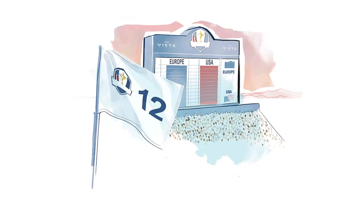
Take a glimpse into my process of creating animated illustrations for the Ryder Cup, and why the client went down an illustrative route.
My advertising clients need their ideas visualised stylistically for their clients. Creative agencies do this to sell a concept before spending the big bucks on a photo shoot or filming for the real thing. More often than not, I can’t share these concept illustrations, as they’re top secret, NDA-protected stuff.
However, sometimes an idea is all that is available, yet promotions still have to go ahead – in which case my illustration becomes the main event, for now… Which is nice. My recent work for golf’s pre-eminent event, The Ryder Cup, needed exactly that.
Next year’s event will take place in Italy at the fully renewed Marco Simone Golf & Country Club. Set within 350 acres of the stunning Roman countryside, complete with a restored 11th Century castle, rolling fairways and undulating greens.
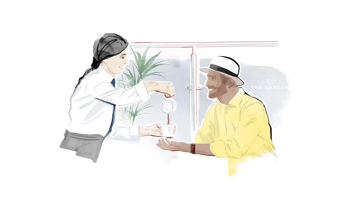
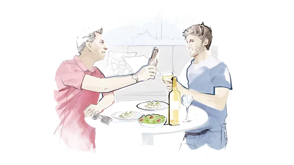
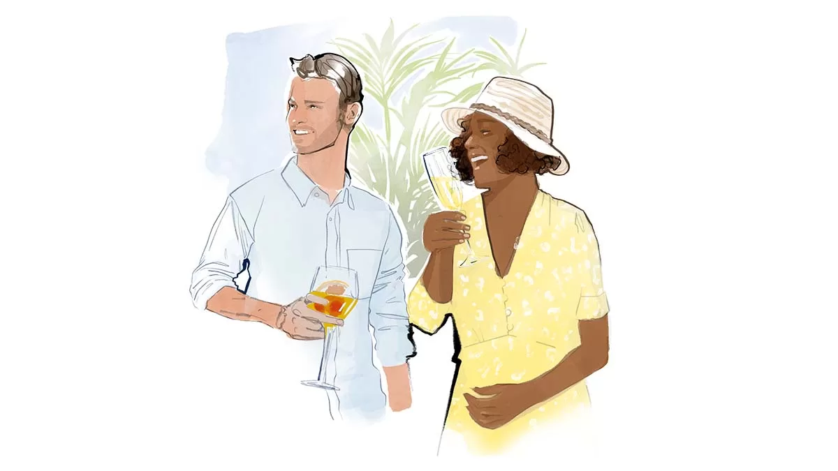
The build for next year’s event is far from complete. The venue’s viewing platforms, grandstands and restaurants remain concepts on architectural drawings and plans. However, the need to sell tickets for experience packages waits for no one.
Instead of using photo-realistic 3D renders of the areas, sports marketing experts Matta decided to go down an evocative, illustrative route to give a sense of space and action, without having to nail down details this early.
I was tasked with creating illustrations for still & animation formats on the RyderCup official website and social media accounts, including Instagram @rydercupteameurope.
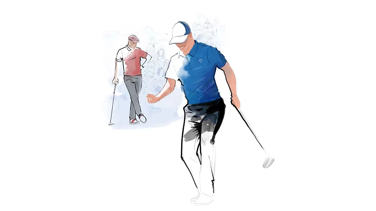
What a buzz! Animated illustrations for the Ryder Cup? OK then! As usual, my process involved starting the project with sketches on the iPad Pro using Adobe Fresco. I then present ideas to the client for their choice of direction.
I finish off artwork on my Wacom Cintiq, working on the details in Photoshop and organising layers.
Depending on how the animation will work, the artwork condensed into layers of line, shade and colour. This admin or sorts – organising layers in a way that can be used and understood by the animator can sometimes take longer than the drawing itself!
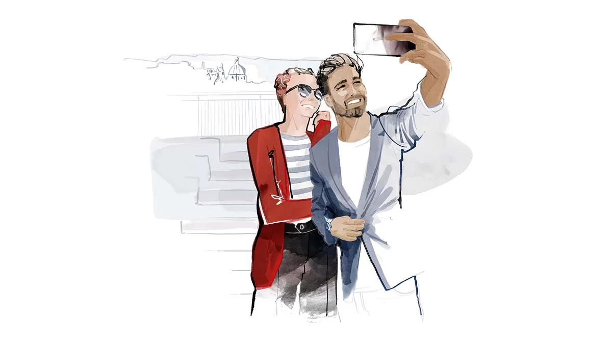
The Art Director restricted the use of colour colours for the images to sit (more or less) within the Ryder Cup brand palate.
Using the iPad and Fresco for initial sketches is a vital part of my workflow. This is because the iPad is portable – it frees me up to quickly draw wherever I am. I also want to be less precious and into the details at this stage, throwing tons of ideas down onto the ‘paper’.
Once the Art Director and client like the direction, I move onto the massive 32” drawing board screen of the Wacom Cintiq tablet. Here I get lost in the details of the chosen illustration. I also organise everything for the animator in photoshop.
Thanks to the team at Matta for the project and Art Direction.
If you want to see more animated projects check out this piece for Saville Row & sparkling wine brand Nyetimber

Still illustrations in use on the Ryder Cup’s official website
