I’m a freelance artist and illustrator, mostly working in the advertising world. A lot of my days involve making high speed visuals for ad concepts, so it’s a good change to have some printed broadsheet editorial work that I can show to the world which doesn’t involve NDA signings!
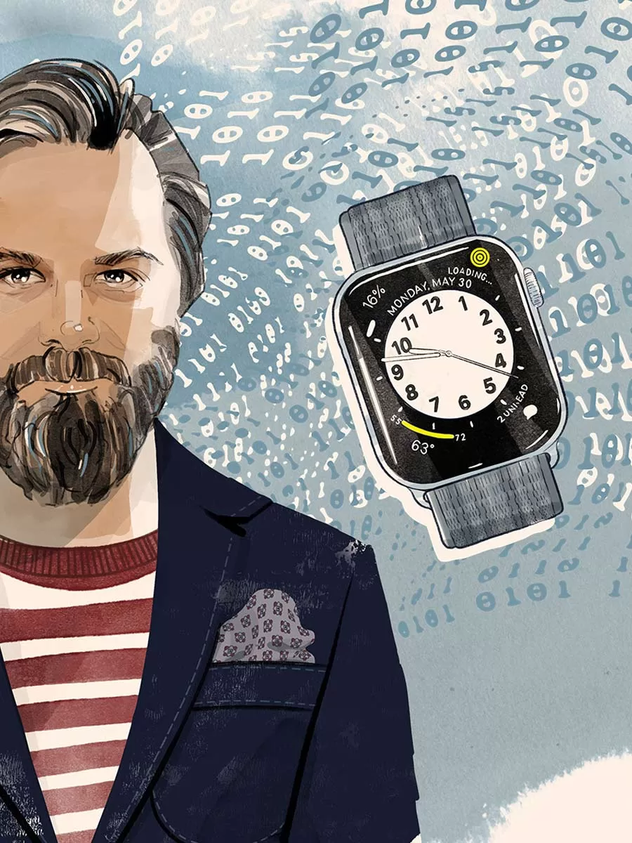
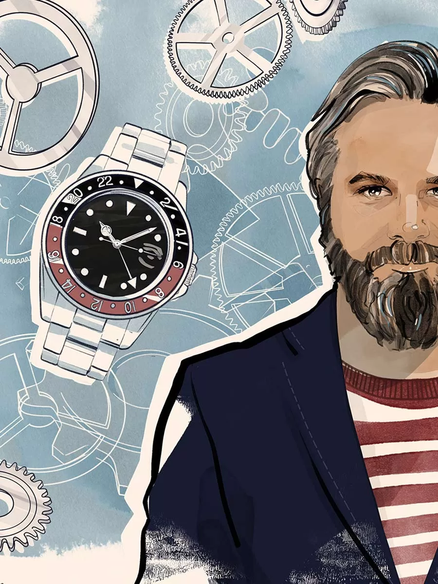
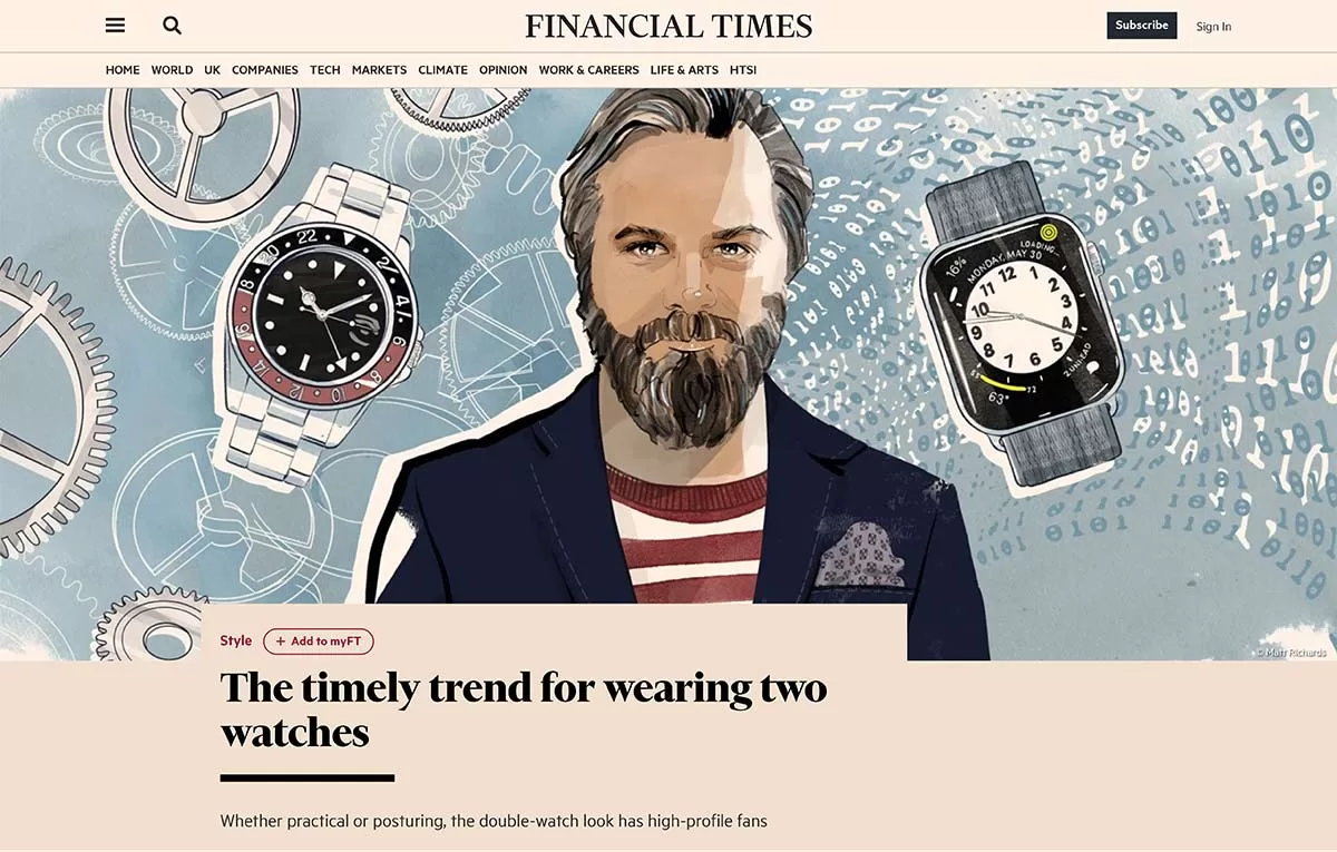
Recently I was asked by the Life & Arts supplement in the Weekend edition of The Financial Times, to make an editorial portrait illustration of Michael Williams, founder of men’s style blog A Continuous Lean.
A Continuous Lean celebrates the small companies, artisans and brands who are producing things in a traditional way. Fast Company named Michael one of the 100 most creative people in business and his writing has appeared in GQ, Men’s Journal, GOLF, The Motoring Journal, Men’s Health and various other national publications.
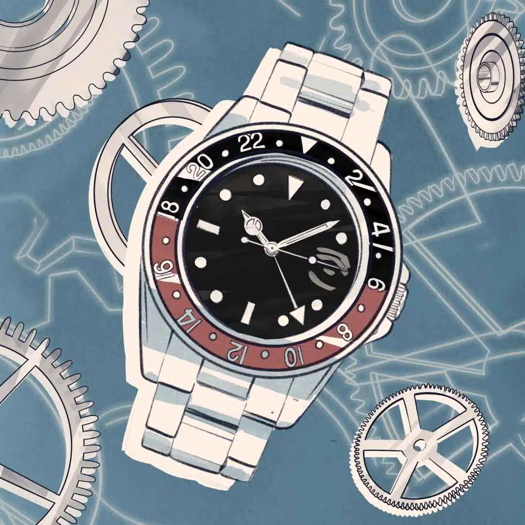
The article I was asked to illustrate, titled The timely trend for wearing two watches, has Micheal pondering whether his own personal style can take to “double-wristing”. Which, taking example from many of its high-profile fans, often involves wearing a smart watch on one wrist and a beautiful clockwork timepiece on the other.
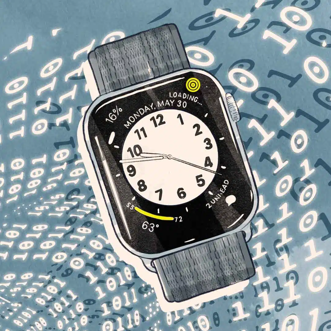
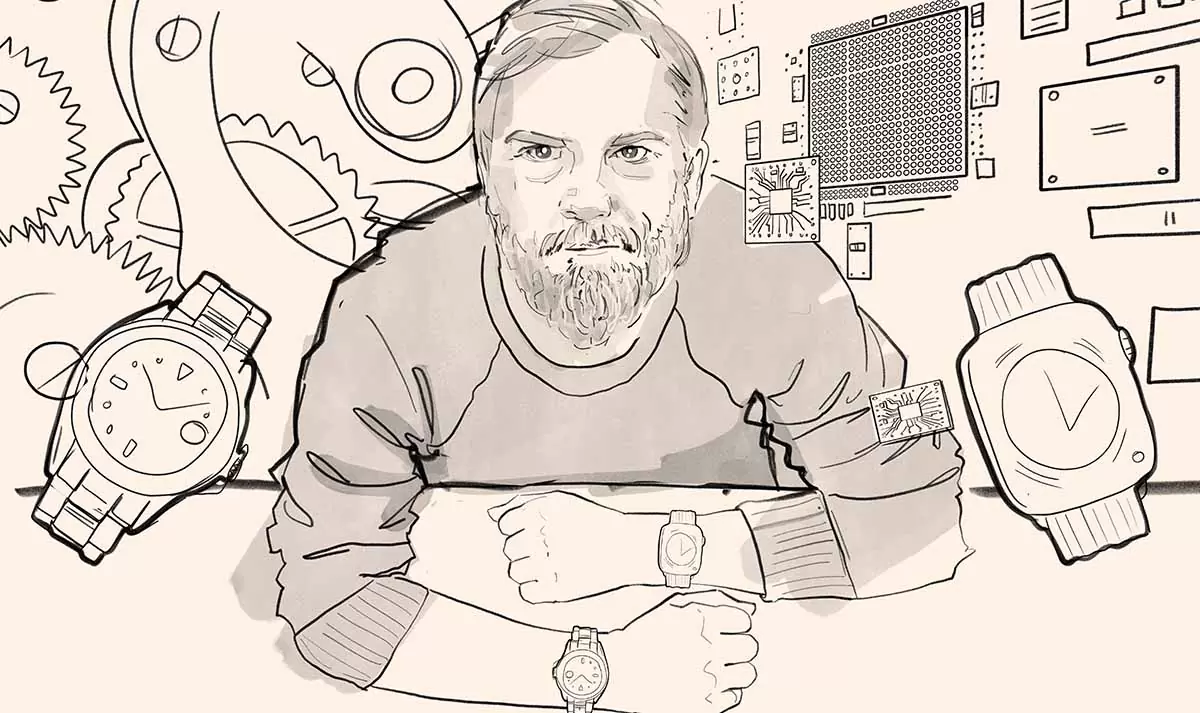
A couple of the rough options submitted for the project
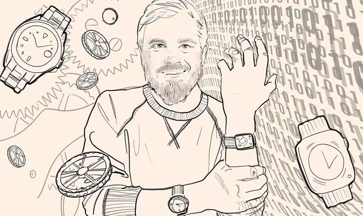
My illustration process first involves sketching out loads of concepts on the iPad Pro using Adobe Fresco for the client to choose a direction. I liked the idea of suggesting the difference between these analogue and digital worlds. Cogs, binary code and micro chips make patterns for the portrait’s background, adding to the narrative of the piece.
With the choice of sketch made by the client and editor, I jumped over to Photoshop on the Wacom Cintiq tablet to work in the details for the final piece.The iPad is so good for sketching because it’s mobile (so you can work from anywhere). It’s all too tempting to get lost in detail when using the larger canvas of the Cintiq so I try to avoid that until I’ve nailed down the concept with the client.
The Cintiq Pro 32 is unrivalled in canvas size. This means you can review your whole piece of work without constantly zooming in an out. It’s also a lot better for your posture when you are working in the same position for hours on end. I’ve lost count the number of times I’ve caught myself slouching over my iPad on the sofa!
You can read the article in full here: FT.com (paywall charges apply).
The FT style section on instagram @financialtimesfashion
See more of my work in my portfolio section and get in touch if you would like to commission an editorial portrait illustration project!
