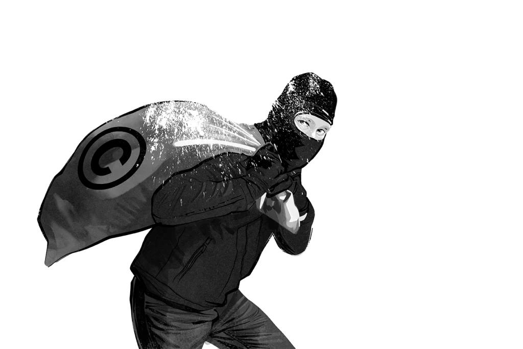
Some thoughts on AI and how it wants to change Copyright Law
Some thoughts on AI and how it wants to change Copyright Law
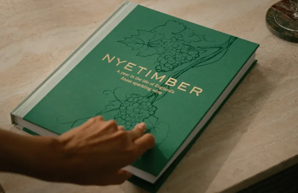
I was thrilled to contribute to Nyetimber’s new coffee table book, A Year in the Life of England’s Finest Sparkling Wine.
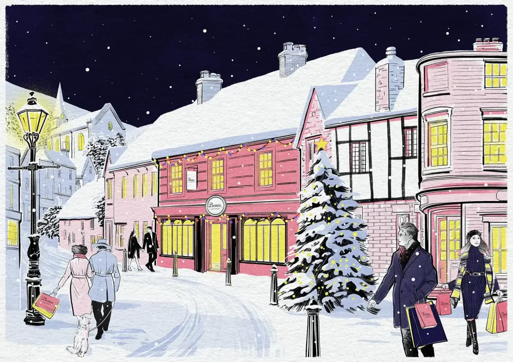
Case study on creating and illustration & animation for lingerie retailer Boux Avenue

Working with London agency Mother, a series of visuals were created for Marks & Spencer’s Christmas campaign

Have you ever wondered how an idea gets turned into an advert? Read on to find out how my storyboards for Schwarzkopf’s latest beauty commercial played their part.

Take a glimpse into my process of creating animated illustrations for the Ryder Cup, and why the client went down an illustrative route.

As a break from advertising work, I created this Editorial Portrait illustration for the Financial Times
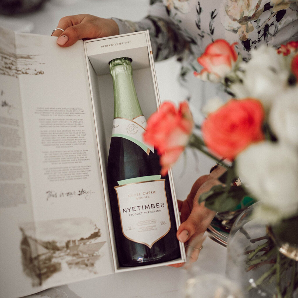
Two lovely packaging illustrations for Nyetimber by illustrator Matt Richards featuring on the brand’s updated gift packaging.


My first venture into illustrated children’s books Princess No Knots is available now